
We were told that creating a logo along with a set typeface and colour palette that we could establish our bank brand. This to me has been the hardest part of this assignment, After a a lot of trial and error though I’ve finally settled on these elements of my brand and feel now I can finally move forward but have discovered that this is by no means all we have to do to establish a recognisable brand that people can Identify with.
Brand Identity are the key elements that make up the ecosystem of your brand, these element include as mentioned before your logo, Brand name, font choice and colour palette but they also include other vital elements such as your tone of voice and visual reinforcement of images and graphics that make up the ‘whys’ of your brand. Once established your brand identity can attract new customers and keep your current customers feel at home. Its crucial you maintain consistency throughout with the elements you use as they reinforce your brands purpose and therefore should really be clear and consistent wherever they may appear.
Would you show up to a big office job for a major design studio in trainers, track bottoms & a T-shirt? Although I do feel if you can produce the desired work and designs it shouldn't matter what you’re wearing but I think the point I’m trying to make is that your brand identity is the face of your business & you always want to put your best foot forward. Along with bringing credibility and trust a strong brand design should give an insight of what the brand is all about. This is where the colours, imagery and use of language & graphics convey the desired tone you want to convey.
When you’re designing your own brand identity, there’s no need to start from scratch. Here are just a few examples of great brand identity design to get some inspiration from.
And while it’s important to create something that’s uniquely your own, there’s nothing wrong with taking a note from some of the greats.
Hootsuite
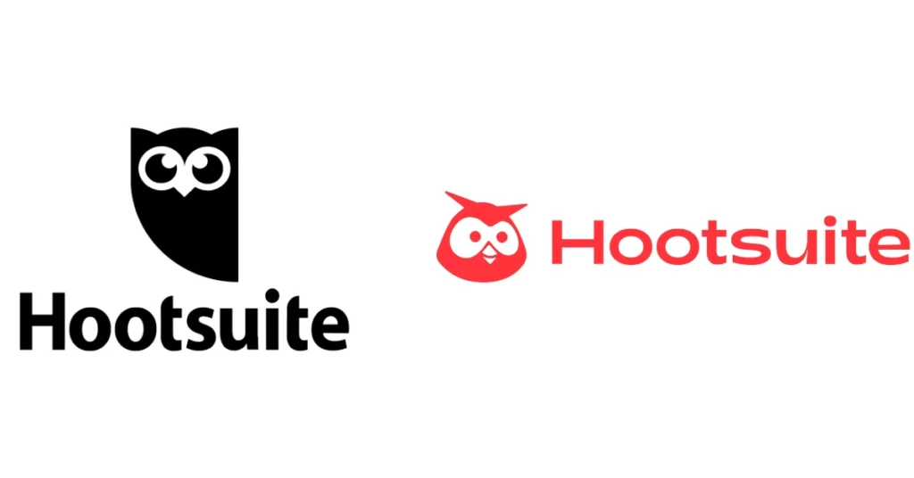
If you look at a lot of tech brands today, you’ll notice that many tend to use similar no-fluff, utilitarian branding principles. While there’s nothing inherently wrong with this, it can become hard to differentiate brands after a while.
We like how Hootsuite’s redesigned logo injects some new color and personality into the social media marketing platform. It’s friendlier, more approachable, and most importantly, more human.
Kodak
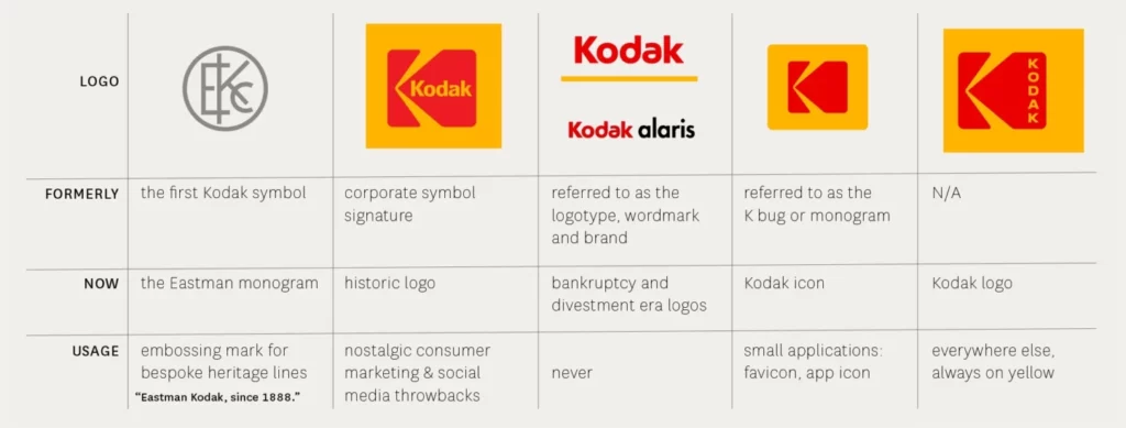
Sometimes, the best rebrands happen when you go back to your roots. In 2006, the company had already eliminated the big red “K” block in favor of a simpler wordmark, but then they decided to reverse the decision. Using a fresh sans-serif font, they were able to create a simple and fresh new take on their logo and typography. It just goes to show that sometimes the smallest of changes can have a big impact.
We love how easy these guidelines make it to view the history of Kodak’s branding, along with the when/how/why to use each design.
Burt’s Bees